The Most Economical Way to Drive More Ecommerce Traffic to Your...
By Tom Wintaugh

Want to read this blog offline?
No worries, download the PDF version now and enjoy your reading later...
 Download PDF
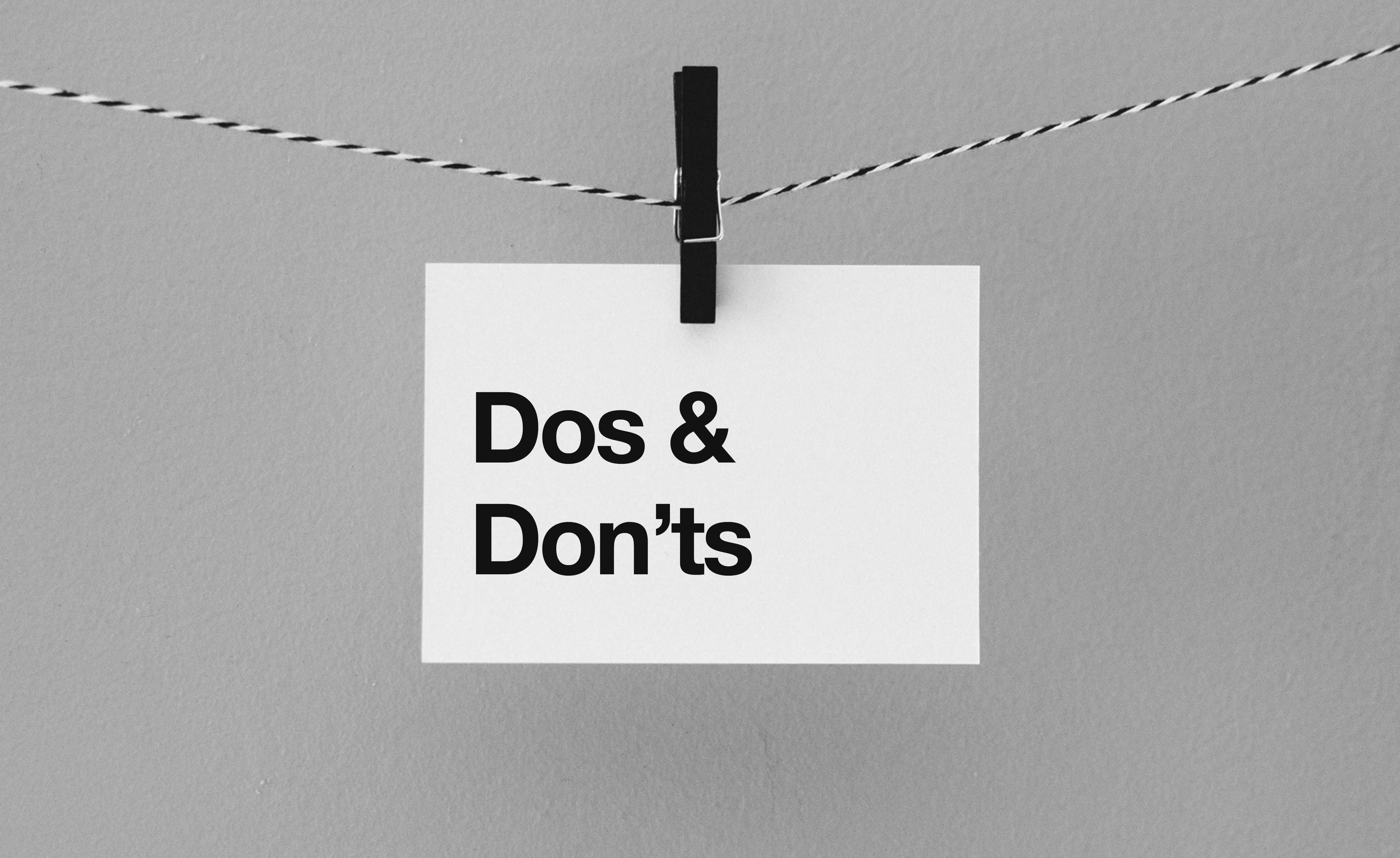
Whether it is something as simple as marking the wrong answer on a test, or spending an inordinate amount of money on an extremely unnecessary item, we have all made mistakes in our lives. Finding a solution and learning from previous mistakes can be easier when mistakes can be quickly recognized.
However, mistakes in web design aren’t always as easy to identify as a wrong answer or spending more than you can afford. There are several strategies online storeowners can implement to avoid common design mistakes in order to help drive revenue and provide a great user experience to new and returning customers.
We have identified a handful of the usual suspects to avoid when designing your online store.
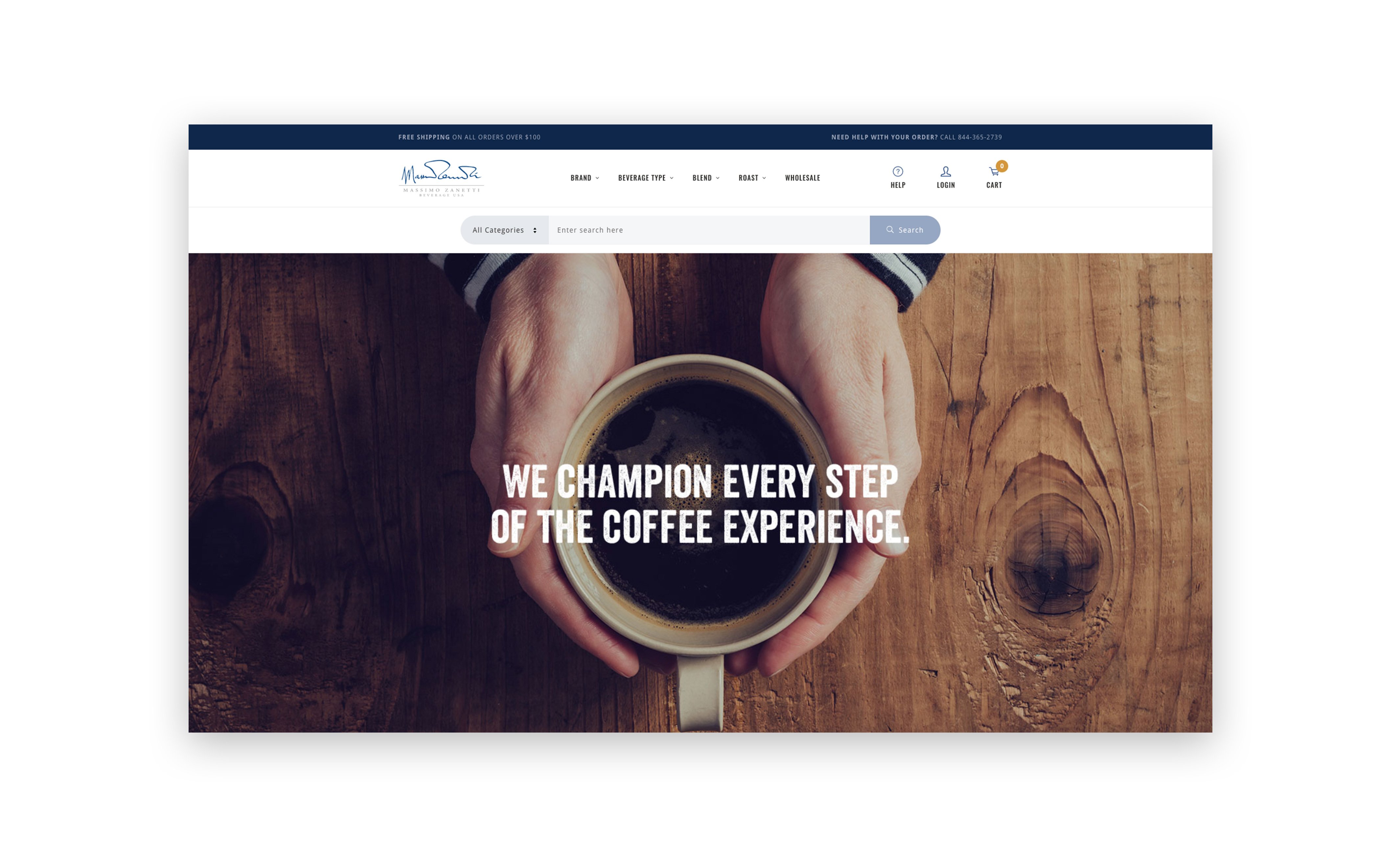
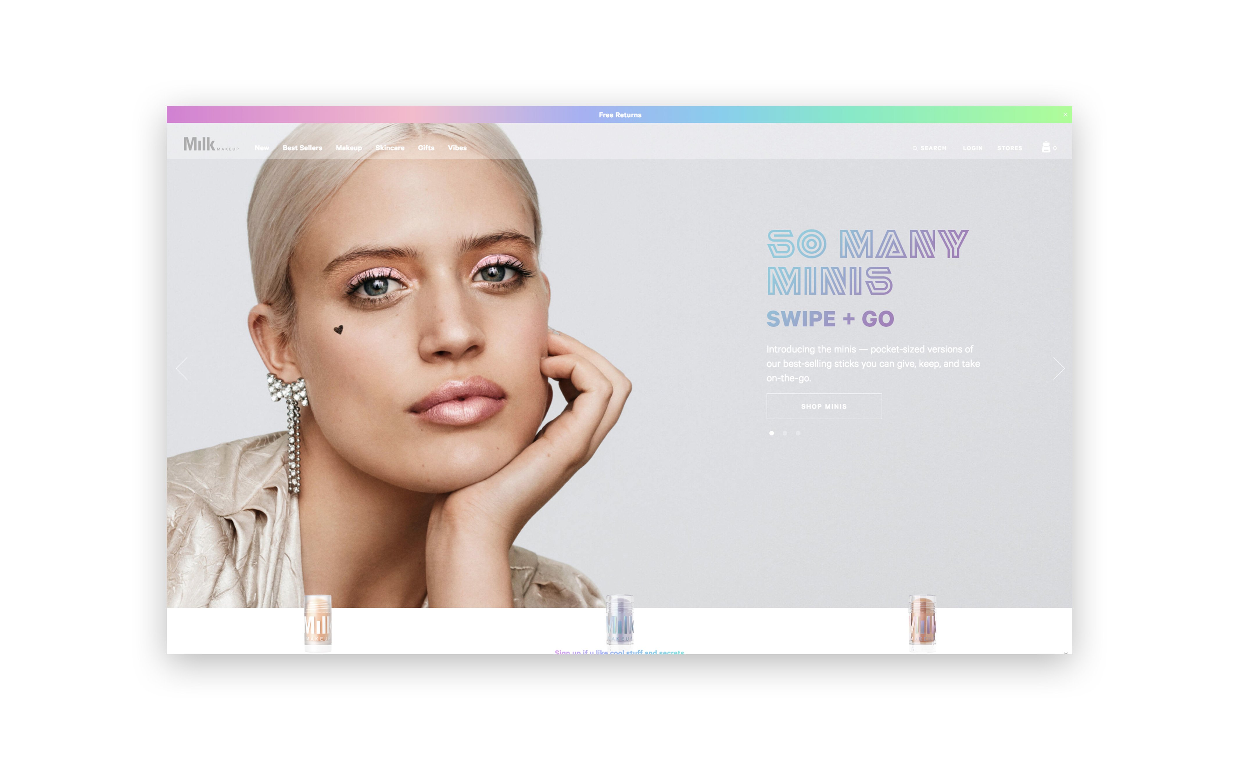
Most of us can acknowledge the value in making a good first impression, and the website header is a potential customer’s first impression of your site. Overcrowding the header is a mistake frequently seen on ecommerce websites. The header is an excellent space to display important information like a business phone number or promotional text. As a global element, the header will appear on any page a user visits. You may be familiar with the best practice of placing the most important items higher on the page, however, a problem develops when too many items are displayed at once, to the point where the header becomes overcrowded and difficult for users to navigate. Remember that having too many competing items in an area can diminish the value and visibility of the important ones.
A well-executed promotion can be used to drive website traffic and generate revenue. However, offering too many promotions can run the risk of devaluing your brand. Sure, your ecommerce business might have a lot of unbeatable offers, but how do you avoid the risk of devaluing your brand and products by promoting too many deals? Are you “crying wolf” too often by styling everything as large, bold and red, thus diminishing the value of primary calls to action (CTAs), such as “Add to Cart” or “Check Out”?
“Above the Fold” is a term that was originally used to describe the content on the top half of a newspaper, before it became synonymous with the content you see on a website before scrolling. Nowadays, customers scroll instinctively, almost as soon as they land on a site. Often times, we see websites packing too much content into the highest portion of the website, in an effort to keep everything in view. However, cramming content sacrifices the valuable white space used in a clean, structured site.
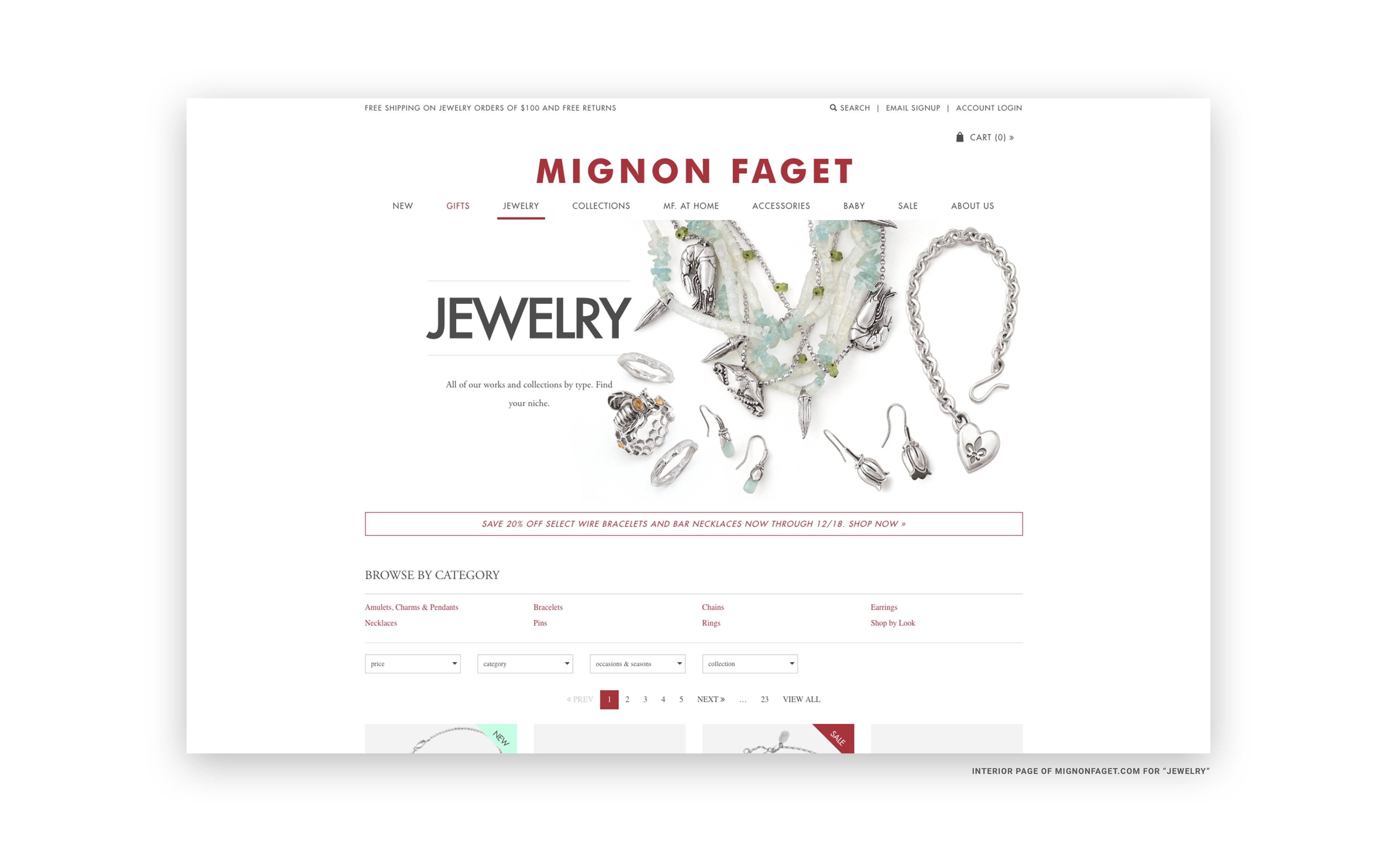
Generally, burying the call to action is a problem specific to product detail pages. When a customer first lands on a product page, the “Add to Cart” button should immediately capture their attention. This call to action should always be the most noticeable thing on the page, however, some websites with complex product descriptions and attributes elect to provide all the necessary information before the user commits to purchase. While on one hand, this allows the shopper to make an informed decision before purchasing, it creates confusion as to what the necessary action on the page actually is. Is it an informational page or can the product be purchased here? Greater visual hierarchy can be accomplished by color or size, and should be displayed above the fold whenever possible.
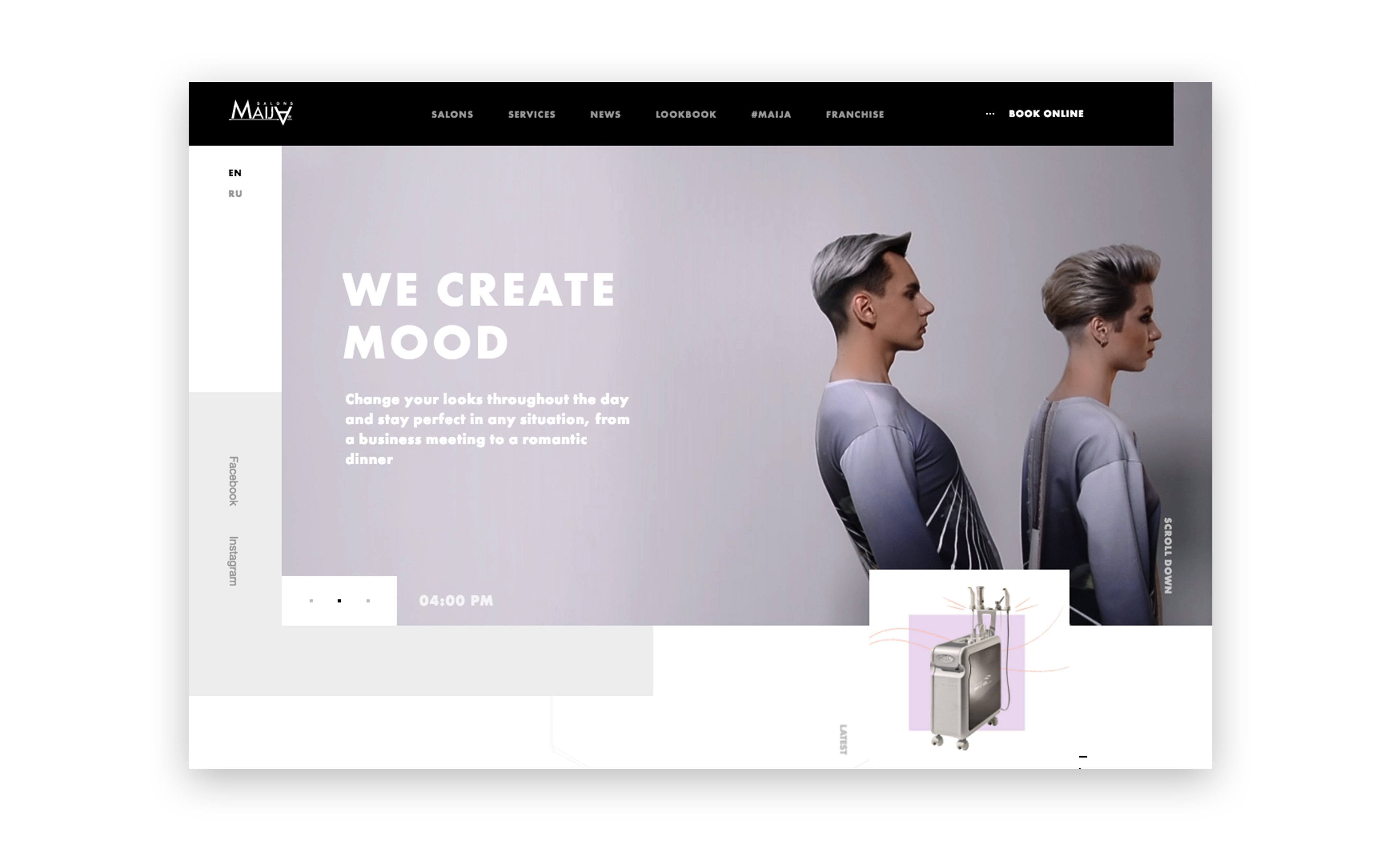
The importance of high-quality product imagery varies from industry to industry, but no one can deny the value that a clear, beautiful product photo brings to any ecommerce website. Selling online provides customers with the convenience of shopping from the comfort of their homes. However, selling online does not allow merchants to physically display products to customers. Ecommerce websites with poor, inconsistent, and small images further hinder selling opportunities by placing doubt of your brand, quality, and professionalism in the minds of consumers.
Reference these five tips as a guide during the website design process to ensure you are staying up-to-date on the latest ecommerce website design trends, and ahead of your competition. These tips are a starting point in your website’s design journey, and no two businesses are alike.
Katie Kindness’s background in graphic design, has prepared her to excel in a fast-paced ecommerce environment. Her impressive portfolio and creativity recently earned her a spot in the Adobe Creative Jam – a design competition showcasing top local designers throughout the United States. Katie leverages her design expertise to create magnificent ecommerce stores for Miva clients.
By Tom Wintaugh

By Tom Wintaugh

By Tom Wintaugh
Sign up to receive the latest in ecommerce news, articles, whitepapers, and more.
OR CALL 800.608.MIVA


